
Communications in complex context
Trainer 2026: David Watson
Additional background material on the broader topic
Introduction
This section introduces the broad (and important) topic of communications for think tanks. In the past, think tanks were used to being found by audiences who went looking for them. But the emergence of the digital space has changed this. To paraphrase Connery (2015), today, audiences expect their information to find and come to them. This means think tanks are now having to diversify how they reach their audiences.
We begin this chapter with a discussion on how to understand communications in a modern think tank. We consider different approaches to communications and present a tool for monitoring and learning from communications.
We then look at communications outputs and channels for think tanks, and discuss new approaches to publishing research in a digital world.
The next section focuses on writing to inspire policy change, sharing tips for good writing in a digital age and how to craft effective messages.
The final section dives into data visualisation, looking at ways to engage audiences with research data, the different types of data visualisation and what it takes to do it well.
Understanding think tank communications
The importance of communications
Communications is too often treated as a tag-team race: once the research is done, it is handed over to a communications person or team to put it into a template and send it out through the same old channels.
But think tank communications is much more than this. And it starts at the research planning stage. It is strategic, helping to define audiences and policy goals from day one. It’s an art of unearthing the research narrative, of shaping messages, and of choosing the right formats, channels and tools to reach and engage your audiences, and ultimately achieve your goals.
After all, even the most high-quality, robust and credible research won’t have an impact if it doesn’t reach the right people, at the right time, and in a way that they can understand and connect with. As Jeff Knezovich (2012) argues, ‘a policy brief is a piece of paper, it doesn’t DO anything on its own’.
Richard Darlington’s (2022 [2017]) article ‘Defying gravity: Why the “submarine strategy” drags you down’ describes how traditional research teams have tended to ‘submerge’ to the bottom of the ocean to conduct their research and analysis, thinking deeply, alone. When finished, they pop up to the surface – often with a 100-page report and some policy recommendations. Most think tanks today recognise that a submarine approach won’t work. But it’s not always deliberate. According to Richard, this is what happens by default when there isn’t a communications strategy.
Modern think tanks must embed communications into their teams and their work from the beginning if they want to have an impact with their research.
Communications as an orchestra
Enrique Mendizabal (2015) has described think tank communications as an orchestra. Rather than thinking about communications through a project-based approach, think tanks should treat their communications as an organisation-wide effort to maximise their chances of informing policy and practice.
Mendizabal believes that a think tank must develop three things:
- A portfolio of communications channels.
- A communications team with clear ownership over those channels.
- Tactics or rules to use these channels and resources strategically.
In Mendizabal’s orchestra model, the head of communications is the conductor: coordinating the different channels, ready to bring the right instruments into play as windows of opportunity arise.
Rather than communications staff being project-based, they should be specialists –developing and honing their skills in events, digital media, publications, and so on (much like the different instrument sections of an orchestra).
Monitoring and learning from your communications
Communications monitoring, evaluation and learning (MEL) often starts and stops with reporting on download statistics or retweets. But these numbers alone only give us a fraction of the picture. They don’t tell us anything about how someone uses your work – or what you could do differently next time to improve your communications and impact.
The communications monitoring, evaluation and learning toolkit authored by Caroline Cassidy and Louise Ball (2018), suggests that think tanks look at two areas:
Strategy and management
You can’t monitor, evaluate and learn from communications if you don’t know what you were trying to do in the first place. So, you need a good plan. To monitor and learn from your communications, you should ask: Did we have a plan for this piece of work, and did we follow it? What can we learn for next time?
Answer these questions in a quick after-action review or meeting, making sure you note down any lessons for next time.
Outputs
There are three dimensions to consider:
- Reach. How many people did you reach? (Most evaluations focus on this because it’s the easiest to track using analytics.) But also, did you reach the right people?
- Quality and usefulness. Was it factually accurate, well-written and grammatically correct, containing clear messages, etc.? How did users receive and perceive it?
- Uptake and use. This is the hardest to measure, but you can begin by recording anecdotal evidence and feedback and start building a picture of how and by whom your work is being used.
The toolkit breaks down key questions and indicators to measure each of these elements.
Having a simple MEL system for your communications function is a great way to start building an evidence base for what works, and to make the case for additional communications resources (Ball, 2018).

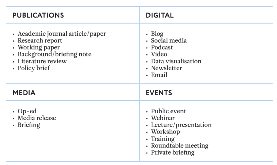
Outputs and channels
Think tanks today have a lot of options for how they engage their audiences. Remember the idea of communications as an orchestra: think tanks can’t just think about communications on a project-by-project basis. They must also build their reputation, credibility and visibility – their brand – with their target audiences over time.
A think tank does this by developing a portfolio of communications channels and tools, and then deciding how to use them strategically. Picking the right output or channel will depend on the content (what is it you want to share) and the audience (who it is intended for).
As a starting point, see this non-exhaustive list and read more in ‘Communications options for think tanks: channels and tools’ (Mendizabal, 2012).
Revolutionising how we publish policy research
Over the last decade, think tanks have worked hard to make their outputs more accessible by investing in communications advice and support. Larger organisations have employed editors, digital content specialists and media experts.
This is great progress as it has encouraged researchers to think a bit differently about how they might present their work – and to focus on telling a good story. As James Georgalakis (2022), Director of Communications and Impact at the Institute of Development Studies, puts it, writing in different formats forces one to ‘synthesise complex ideas, reproduce them in plain language and think through their real-world implications.’
Given the amount of information people now have at their fingertips through iPhones, tablets, and so on, research centres’ choice of output is changing. While longer reports remain important because of their depth of analysis, shorter and more specific outputs – like blogs – have become very popular.
In a radical rethinking of how we publish our research, Joe Miller (2020) asked: research isn’t linear, so why are reports? This led to Joe’s (non-linear) book: Screen, Research and Hypertext. Non-linear reporting is about letting readers choose their own path through the work, thereby making their own connections and increasing their learning.
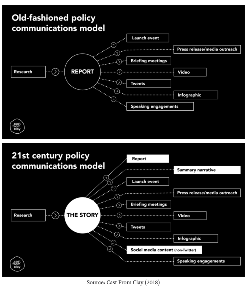
The 21st-century policy communications model
In 2018, Cast From Clay proposed a new model for policy communications. They argue that old models put the report at the centre of the think tank’s time and efforts, with key messages extracted and packaged up into other outputs to promote the report. In the new model, the report is just one of multiple assets that are used to communicate a story – the central message or narrative that you want people to hear.
Writing to inspire policy change
The power of good writing
Much has been written about the art of writing clearly. George Orwell’s six rules, published back in 1946, still hold true today:
- Never use a metaphor, simile, or other figure of speech that you are used to seeing in print.
- Never use a long word where a short one will do.
- If it is possible to cut a word out, always cut it out.
- Never use the passive where you can use the active.
- Never use a foreign phrase, a scientific word, or a jargon word if you can think of an everyday English equivalent.
- Break any of these rules sooner than say anything outright barbarous.
Then there are more contemporary practical guidelines, such as The Guardian’s Style Guide and Cast From Clay’s ‘Please get to the point’.
At its core, strong writing is about ensuring that think tanks have a very clear message for the audience they are seeking to influence or interact with. As the acclaimed writer and two-time Pulitzer Prize winner, David McCullough, explains:
‘Writing is thinking. To write well is to think clearly. That’s why it’s so hard.’
Style guides
Maintaining a consistent organisational ‘voice’ is worth investing in. One of the best ways for organisations to develop and maintain good writing is by developing organisational style guides.
As a complement to style guides, publication policies are also crucial tools to define the desired length, tone, audience and branding and quality control processes of different types of content. See CIPPEC’s approach to improving the quality of its publications.
By developing style guides and publication policies, organisations can elevate their editorial standards. For this reason, it’s worth putting together solid and well-presented guides and policies, which are updated frequently and systematically disseminated to staff, including new hires.
Crafting effective messages
Every well-written report, compelling presentation, or effective communication output has strong messaging at its core. A common mistake is not to think about messaging at all. It’s often assumed that summarising and delivering information is enough. But effective communication requires a clear message – or set of messages – aligned with your aim.
Messages are ‘the tip of the iceberg’ (Young and Quinn, 2012). They represent what your audience most needs to know. This message is supported by the main information (the rest of the iceberg).
You need to help your audience understand and absorb your message. When writing your key messages, the most important consideration is your audience. Who are they? What do you need them to know and why? What do they care about? What interests them?
Heath and Heath (2007) discuss six dimensions of effective messaging. Originally from the marketing realm, these principles are universally applicable to all forms of communication, including the translation of evidence for policy-making. Effective messages are:
- simple
- unexpected
- concrete
- credible
- emotional
- stories.
It is common for clear and effective messages to be refined after the report has been written, for instance, when drafting a blog or a presentation to promote the research. However, it is helpful to develop your messages after the research is complete, but before the report is written. This will help shape the report structure and inform strategic decisions about the outputs and channels needed to tell your research story.
Data visualisations
Although think tanks use a wide variety of research techniques, technological advances have put a focus on working with big data. But working with large data sets can be challenging.
Data visualisation epitomises the current challenges that think tanks face when communicating with wider audiences.
For example, it’s often difficult to make sense of that much raw data. It’s a classic ‘wood for the trees’ problem – facing so much detail that it’s difficult to see the bigger picture. That’s one reason why think tanks are investing heavily in data visualisation capacities and techniques.
Not only do data visualisations help support the research process itself, but they can also help communicate large quantities of information to a wider, less technical audience.
Data visualisations and policy influence
The ability of data visualisations to effectively communicate data makes them a powerful tool for think tanks. Take, for example, Florence Nightingale’s ‘coxcomb’, or ‘rose’ diagram of the causes of British military deaths during the Crimean War:
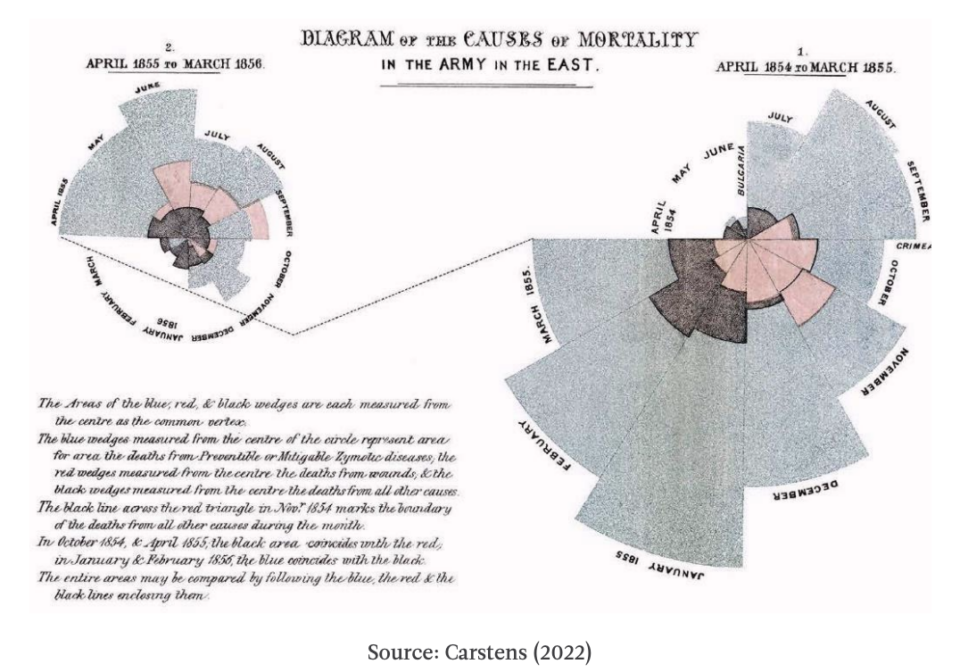
The diagram shows that most deaths were caused by preventable diseases, not battle wounds. Nightingale used it to lobby British parliamentarians for better sanitary conditions – initially in the army, but eventually back on the home front, too. It contributed to the establishment of modern nursing and better sanitary conditions across the UK, as codified in the Public Health Acts of 1874 and 1875.
During the early stages of COVID-19, the media frequently relied on logarithmic graphs to show how the situation was worsening. Romano, Sotis, Dominioni and Guidi (2020) carried out an experiment to test how well people understood logarithmic and linear graphs. The results showed that the use of logarithmic graphs to convey information was counterproductive. Many people found them hard to interpret. Worse still, it affected people’s attitudes towards the pandemic and thus their policy preferences; people who viewed logarithmic graphs felt reassured that things would eventually get better, which was the opposite of the intended message.
What kinds of visualisations are there?
The term ‘data visualisation’ refers to the creation of graphical representations of data, both quantitative and qualitative in nature, although quantitative data is particularly well-suited to visualisation.
One way to think of different types of data visualisations is by their format, which is also linked to their level of user interactivity – either static, motion or interactive graphics. Static visualisations, such as bar charts or pie charts, are typically used to highlight key facts in reports, posters and on social media (e.g. Don’t limit her possibilities from JumpStart Georgia). Motion graphics are useful for explaining complex data and telling a story (e.g. Visualizing the past, present and future of carbon emissions by the World Resources Institute). And while these two forms tend to be linear, interactive visualisations offer multiple pathways, allowing users to choose how they explore and engage with the data.
What goes into effective data visualisation?
At the heart of any effective data visualisation should always be the objective and the end-user. Data visualisations are targeted at the subconscious mind and designed to be both immediately comprehensible and aesthetically pleasing. This can be particularly important when working to engage policymakers, as they tend to have limited time and short attention spans.
There are three main skills needed to produce effective data visualisations:
- Research: the ability to handle and understand the raw data.
- Design: knowing the appropriate types of visuals for the data; understanding chart design fundamentals; understanding principles of balance and flow; and knowledge of the appropriate use of colour, typography, and other visual cues.
- Communications: the number of visualisations that either don’t have a clear message or a clear purpose is staggering. Communicating the right messages is very important. At the same time, it’s important not to oversimplify or misconstrue the data.
For think tanks, building the capacity to create effective data visualisations is often about finding and creating teams that can collaborate across these three areas. However, one of the benefits of the modern explosion in data visualisation is the tools and technologies that support their creation.
References and further reading
- Ball, L. (2018). Communications professionals: Fight back with evidence.
- Blenkinsop, I. (2016). Writing a style guide: What you need to know.
- Burall, S. (2019). Webinar on Public engagement: Practical lessons.
- Burnet, K. (2019). New approaches to research, audience engagement and impact.
- Cairney, P. and Kwiatkowski, R. (2017). How to communicate effectively with policymakers: Combine insights from psychology and policy studies.
- Carafano, J. J. (2015). Think tanks aren’t going extinct. But they have to evolve.
- Carstens, A. (2022). Florence Nightingale’s diagram of the causes of British military deaths during the Crimean War in Diagrammatic War, 1858.
- Cassidy, C. and Ball, L. (2018). Communications monitoring, evaluation and learning toolkit.
- Cast From Clay (2018). A new model for think tank communications.
- Connery, M. (2015) The digital think tank.
- Darlington, R. (2022 [2017]). Defying gravity: Why the ‘submarine strategy’ drags you down.
- Dempster, H. (2019). The evolution of think tank research communications: Here’s what I’ve learned.
- Georgalakis, J. (2022 [2015]). Never mind the X Factor this is the So What Factor.
- Heath, C. and Heath, D. (2007). Made to stick.
- Hovland, I (2005b). Planning tools: How to write a communications strategy.
- Hovland, I. (2005a). Successful communication: A toolkit for researchers and civil society organisations.
- Hupfer, L. (2019). Defining public engagement as a value of your think tank.
- Knezovich, J. (2012) A policy brief is a piece of paper, it doesn’t DO anything on its own.
- Knezovich, J. and Julian, M. (2013). Taking think tank communications to the next level: Figuring out where to begin.
- Mendizabal, E. (2012.) Communication channels and tools for research centres.
- Mendizabal, E. (2014). Communicating complex ideas: Translating research into practical social and policy changes.
- Mendizabal, E. (2015). Communications as an orchestra.
- Miller, J. (2014). Finding home: How the century foundation took its first small step beyond the PDF.
- Miller, J. (2020). Research isn’t linear, so why are reports?
- Nicholls, J. (2016). From comms chaos to calm: My year-long journey.
- R.L.G. (2013). Johnson: Those six little rules.
- Romano, A., Sotis, C., Dominioni, G. and Guidi, S. (2020). The public do not understand logarithmic graphs used to portray COVID-19.
- Schwartz, J. (2015). What does the future of think tanks communications hold? A conversation with John Schwartz, Managing Director at Soapbox.
- Scott, N. (2012). ODI’s award-winning online strategy explained.
- Scott, N. (2013). Moving beyond the report + media coverage communications model (or why Prospect’s ‘Publication of the Year’ award should be ‘Research Communications Project of the Year’).
- Sen, A. (2015). Thinking strategically to ‘catch’ the media’s attention.
- Shrivastava, A. (2019). Rethinking communications: How ‘ideas of scale’ could be the next leap for research groups.
- Tanner, J. (2022 [2013]). Welcome to the media – these are the rules.
- The Guardian (2021). Guardian and Observer style guide.
- Young, E. and Quinn, L. (2012). Making Research Evidence Matter: A Guide to Policy Advocacy in Transition Countries.
Articles and reports
Videos
This webinar, led by Michael from Media Tank Productions, introduces how think tanks and policy organisations can use video to increase the reach and influence of research and policy work.